
📖 The Question#
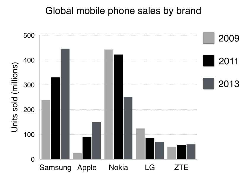
The chart below shows global sales of the top five mobile phone brands between 2009 and 2013.
Summarise the information by selecting and reporting the main features, and make comparisons where relevant. Write at least 150 words.
(Source: IELTS Simon Video Course Writing Task 1 Lesson 3 Bar Charts)
🏆 The Essay#
Introduction (引言)#
The bar chart compares the number of mobile phones sold worldwide by the five most popular manufacturers in the years 2009, 2011 and 2013.
Overview (概述)#
It is clear that Nokia sold the most mobile phones between 2009 and 2011, but Samsung became the best selling brand in 2013. Samsung and Apple saw the biggest rises in sales over the 5-year period.
Body Paragraph 1 (細節段落 1)#
In 2009, Nokia sold close to 450 million mobile phones, which was almost double the number of handsets sold by the second most successful manufacturer, Samsung. Over the following four years, however, Nokia’s sales figures fell by approximately 200 million units, whereas Samsung saw sales rise by a similar amount. By 2013, Samsung had become the market leader with sales reaching 450 million units.
Body Paragraph 2 (細節段落 2)#
The other three top selling mobile phone brands between 2009 and 2013 were LG, ZTE and Apple. In 2009, these companies sold around 125 million, 50 million and 25 million mobile handsets respectively, but Apple overtook the other two vendors in 2011. In 2013, purchases of Apple handsets reached 150 million units, while LG saw declining sales and the figures for ZTE rose only slightly.
🔑 Collocations & Vocabulary (亮點單字與片語)#
- Almost double the number of: 幾乎是…數量的兩倍
- Fell by approximately…: 大約減少了…(用於描述具體跌幅)
- Rise by a similar amount: 上升了相似的幅度
- Overtook: 超越(描述數據交叉、名次對調必備)
- Declining sales: 下滑的銷售量
- Rose only slightly: 僅微幅上升
💡 The Strategy (柱狀圖解題 4 步曲)#
1. 📝 Paraphrase (改寫題目)#
寫 Introduction 就是改寫題目,一句即可。運用替換詞彙將題目重新包裝,並精準點出圖表的主軸與時間範圍。
- 高分句型:
The bar chart compares the number of... sold worldwide by [X] different companies in the years [A], [B] and [C].
2. 🌟 Overview (找出全貌與核心趨勢)#
Overview 是 Task 1 的關鍵!一共兩句。找出誰是最大柱體(市場龍頭)、交叉點(市佔率發逆轉),以及成長幅度最顯著的。
- 高分句型:
It is clear that [Company A] was the dominant leader initially, but [Company B] became the best selling brand by the end of the period.
3. 📊 Details Paragraphs (數據分組與比較)#
將數據拆成兩個段落(Detail 1 & Detail 2),每段三句。最直覺的分組邏輯是「冠亞軍分一組」,「其餘分另一組」。著重描述倍數關係、增減幅度和超車的關鍵年份。
- 比較級與倍數:
almost double the number of,respectively - 趨勢描述:
fell by [X] units,reached a peak of,rose only slightly
4. 🔤 Essential Vocabulary (必備高分字彙)#
想取得高分,替換掉單調的動詞和名詞是必要的。
- 📱 產品代稱替換:
mobile phones,handsets,mobile handsets,units,devices - 🏢 公司代稱替換:
brands,manufacturers,vendors,companies