
📖 The Question#
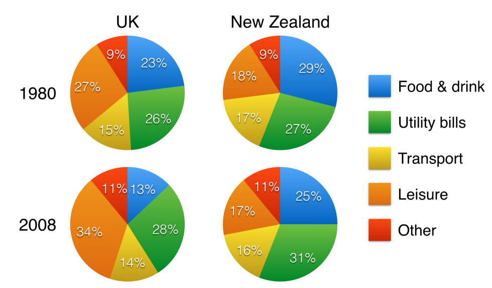
The charts below show household spending patterns in two countries between 1980 and 2008.
Summarise the information by selecting and reporting the main features, and make comparisons where relevant. Write at least 150 words.
(Source: IELTS Simon Video Course Writing Task 1 Lesson 4 Pie Charts)
🏆 The Essay#
Introduction (引言)#
The pie charts compare five categories of household expenditure in the UK and New Zealand in the years 1980 and 2008.
Overview (概述)#
It is noticeable that the proportion of spending on food and drink fell in both countries over the 28-year period, while spending on utility bills rose. Also, UK residents spent a significantly larger percentage of their household budgets on leisure than their New Zealand counterparts.
Body Paragraph 1 (細節段落 1)#
In 1980, 29% of an average New Zealand household budget went on food and drink, while the equivalent figure for a UK home was 23%. By 2008, expenditure on food and drink had fallen by 4% in New Zealand, and by a full 10% in the UK. By contrast, both countries saw an increase in expenditure on utility bills for the average home, from 27% to 31% in New Zealand and from 26% to 28% in the UK.
Body Paragraph 2 (細節段落 2)#
Leisure activities accounted for the highest proportion of UK household spending in both years, but only the third highest proportion in New Zealand. In fact, in 2008, New Zealanders spent only half as much in relative terms on recreation (17%) as UK residents (34%). In both countries, transport costs and other costs took roughly 15% and 10% of household budgets respectively.
🔑 Collocations & Vocabulary (亮點單字與片語)#
- Fell in both countries / Rose: 同步下跌 / 上升(精簡對比兩國趨勢)
- Significantly larger percentage: 顯著較高的百分比
- …went on…: (資金)花費在…之上
- The equivalent figure: 對等的數據 / 對應的數字
- Had fallen by [X]%: 已經下跌了…(注意 Simon 這裡使用了過去完成式)
- An increase in expenditure on: 在…消費支出上的增加
- Accounted for the highest proportion of: 佔了最高比例
- Only half as much in relative terms on… as…: 相對而言,在…上的花費只有另一方的一半
💡 The Strategy (圓餅圖解題 4 步曲)#
1. 📝 Paraphrase (改寫題目)#
寫 Introduction 就是改寫題目,一句即可。圓餅圖的寫作核心是「分配與比例」,把容易替換的字,如 spending patterns 改寫為 categories of household expenditure,並清楚交代對比的兩個國家與年份。
- 高分句型:
The pie charts compare [X] categories of household expenditure in [Country A] and [Country B] in the years [Year 1] and [Year 2].
2. 🌟 Overview (找出全貌與核心趨勢)#
Overview 是 Task 1 的關鍵!一共兩句。觀察圓餅圖時,請橫向對比「項目的演變(增長/減少)」以及縱向對比「兩國間的最大差異」。
- 高分句型:
It is noticeable that the proportion of spending on [X] fell in both countries over the period, while...
3. 📊 Details Paragraphs (數據分組與比較)#
將數據拆成兩個段落(Detail 1 & Detail 2),每段三句。永遠不可以像流水帳般塞數據,把表現類似的分成同一組,其餘分另一組」。
- Detail 1 (動態趨勢組): 抓出「Food & Drink」與「Utility bills」,因為這兩個項目在兩國都展現了相同的增減趨勢,放在一起對比非常工整。
- Detail 2 (靜態對比組): 聚焦於兩國差異最大的「Leisure(休閒)」,並用
only half as much作倍數對比,最後將剩餘比例穩定的項目(Transport、Other)用respectively一筆帶過。
4. 🔤 Essential Vocabulary (必備高分字彙)#
想取得高分,我們要不斷替換「開銷」與「比例」的同義詞,避免用字重複。
- 💰 消費/支出替換:
spending,expenditure,household budgets,costs - 📊 比例/百分比替換:
proportion,percentage,figure,relative terms