
📖 The Question#
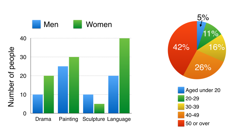
The bar chart below shows the numbers of men and women attending various evening courses at an adult education centre in the year 2009. The pie chart gives information about the ages of these course participants.
Summarise the information by selecting and reporting the main features, and make comparisons where relevant. Write at least 150 words.
(Source: IELTS Simon Video Course Writing Task 1 Lesson 6 Two Different Charts)
🏆 The Essay#
Introduction (引言)#
The bar chart compares the numbers of males and females who took four different evening classes in 2009, and the pie chart shows the age profile of these attendees.
Overview (概述)#
It is clear that significantly more women than men attended evening classes at the education centre. We can also see that evening courses were much more popular among older adults.
Body Paragraph 1 (細節段落 1:柱狀圖 - 課程與性別)#
According to the bar chart, drama, painting and language courses all attracted more women than men to the education centre in 2009. Language classes had the highest number of participants overall, with 40 female and 20 male students, while painting was a popular choice among both genders, attracting 30 female and 25 male attendees. The only course with a higher number of males was sculpture, but this course was taken by a mere 15 people in total.
Body Paragraph 2 (細節段落 2:圓餅圖 - 年齡分佈)#
Looking at the age profile pie chart, we can see that the majority of people attending evening lessons were over 40 years of age. To be precise, 42% of them were aged 50 or more, and 26% were aged between 40 and 49. Younger adults were in the minority, with only 11% of students aged 20 to 29, and only 5% aged under 20.
🔑 Collocations & Vocabulary (亮點單字與片語)#
- Significantly more women than men: 顯著更多的女性而非男性(做對比的完美句型)
- Age profile: 年齡結構 / 年齡分佈
- Attracted more women than men: 吸引了更多女性而非男性
- A mere 15 people: 僅僅 15 人(常用於強調數值極小)
- The majority of…: 大多數的…
- Were in the minority: 佔少數
💡 The Strategy (混合圖表解題 4 步曲)#
1. 📝 Paraphrase (改寫題目)#
寫 Introduction 就是改寫題目,一句即可。用一個 and 將兩個圖表的描述連接起來,利用 compares the numbers of... 和 shows the age profile of... 清楚劃分兩者的功能。
- 高分句型:
The bar chart compares [Chart 1 Info], and the pie chart shows [Chart 2 Info].
2. 🌟 Overview (找出全貌與核心趨勢)#
Overview 是 Task 1 的關鍵!一共兩句。既然有兩張圖,最完美的結構就是「一張圖寫一句核心趨勢」。第一句總結柱狀圖的性別差異(女性顯著較多),第二句總結圓餅圖的年齡特徵(年長者更受歡迎)。
- 高分句型:
It is clear that [Trend 1]. We can also see that [Trend 2].
3. 📊 Details Paragraphs (數據分組與比較)#
將數據拆成兩個段落(Detail 1 & Detail 2),每段三句。混合圖表分組邏輯非常簡單明瞭:「一個圖表獨立寫成一個細節段」。
- Detail 1: 完全聚焦在柱狀圖(4 門課程的男女比例),精準點出最大值(Language)與特殊反轉值(Sculpture)。
- Detail 2: 完全聚焦在圓餅圖(年齡層比例),從佔比最大(50 歲以上)一路描述到佔比最小(20 歲以下)。
4. 🔤 Essential Vocabulary (必備高分字彙)#
在描述人數與年齡層時,靈活替換代稱與程度詞是衝高分數的關鍵。
- 👥 性別與學員代稱替換:
men/women,males/females,participants,attendees,students - 🔢 極端值與精準描述:
the highest number of... overall,a mere(僅僅),To be precise(精確來說)